The Science Behind Posters That Light Up: Materials, Technology, and Visual Psychology

A movie theater lobby shines because a bright poster stands out. The science behind posters involves using special lighting and smart materials to create bold colors and clear designs. This science carefully considers how light interacts with different surfaces and shapes. Designers apply the science behind posters to enhance each image’s visibility. Additionally, the science behind posters explores how colors and designs influence emotions and how people remember the message.
Key Takeaways
LED lights make posters shine bright and last a long time. They use less energy and help save money. The colors look bold and easy to see.
Strong, clear materials with special coatings keep posters safe from harm. These coatings help the light spread out evenly. This makes the poster easier to see.
Smart technology like sensors and apps can change how posters look. They let posters react to people nearby. This makes posters more fun and helpful.
Colors and shapes in posters can change how people feel. They also help people remember the message. Designers pick them carefully to get attention.
Good posters use easy words and strong symbols. They have features that let people interact with them. This helps people stay interested and feel connected.
Science Behind Posters
Light Sources
The science behind posters that light up starts with picking a light source. Designers usually pick LEDs, electroluminescent films, or photoluminescent inks to make posters glow. LEDs are the top choice for posters that need light. They use less energy than halogen bulbs and give off bright, even light. LEDs also stay cooler, so the poster does not get too hot and costs less to keep cool.
LEDs can be dimmed and their color changed, so designers have more choices for how the poster looks.
Halogen bulbs make warm colors and show colors well, but they use more power and do not last as long.
Sunlight can make posters look lively, but it can also cause UV damage, glare, and uneven lighting.
The science behind posters shows that LEDs are best for saving energy, being flexible, and saving money over time. Lighting studies show that LEDs use less energy and cost less to keep up than halogen bulbs. Poster design tests show that LED lights make colors pop and grab more attention.
Substrate Materials
The science behind posters also looks at what materials are used as substrates. These materials need to spread light well, last a long time, and protect from the environment. Good glass and clear plastics with anti-reflective coatings help light spread out evenly. These materials also do not scratch easily and can handle bumps, so they work well in busy places.
Hydrophobic coatings made from fluoropolymers keep water away, so posters stay clean and clear.
Silicone or rubber gaskets seal the edges to keep out dust and water.
Thermal management features stop the poster and lights from getting too hot.
Material science research shows these features help posters last longer. Durability tests show that coatings and seals are important for keeping posters safe. Research says using the right substrate materials helps light spread out and makes posters last longer.
Diffusers and Coatings
Diffusers and coatings are important in poster design because they control how light hits the surface. The science behind posters says to use coatings that make colors brighter and cut down on glare. Glossy coatings make colors look bold, but they can cause glare if the lights are bright. Matte coatings cut glare and make posters easier to read, but they can make colors look dull and lower contrast.
Satin coatings give a good mix, making colors bright but not too shiny.
Semi-gloss finishes are good for posters with words and pictures, and they work well in different lights.
Visual studies show that satin or semi-gloss coatings work best for posters that light up. These finishes help keep colors strong and words easy to read. User feedback shows that posters with balanced coatings get more attention and share their message better.
Note: The science behind posters uses information from lighting, material, and visual studies to make designs stand out. Poster design depends on picking the right lights, materials, and coatings to get the best results.
Technology and Integration
Power and Circuitry
Power and circuitry are very important for posters that light up. Designers pick LED technology because it works with smart controls. These systems can connect to power with USB, WiFi, or apps. People can change poster content and lights right away. Touch screens and motion sensors make posters more fun to use. Posters can react when someone moves or touches them. This makes the experience more interesting. Sensors gather information about how people use the poster. Designers use this information to make better posters and change content for users.
Integration Methods
Modern posters use different ways to mix lights with materials for smooth effects.
Magnetic sheets let posters move and be placed in new spots.
Smart materials have conductive inks, sensors, and tiny electronics. These parts help posters react to changes or what people do.
LED posters often use magnetic and earth-friendly materials, so they are easy to move and better for nature.
Modular LED screens can be set up fast and used in many places.
Features like AI, IoT, and NFC help posters change content using live data.
Some posters use mushroom-based materials that are safe for the earth.
Smart integration connects real posters with digital things. IoT systems let posters work with sensors and cloud services. This setup helps posters update quickly and work well. Posters can show new information right away, which is good for ads and sharing news.
Dynamic Lighting
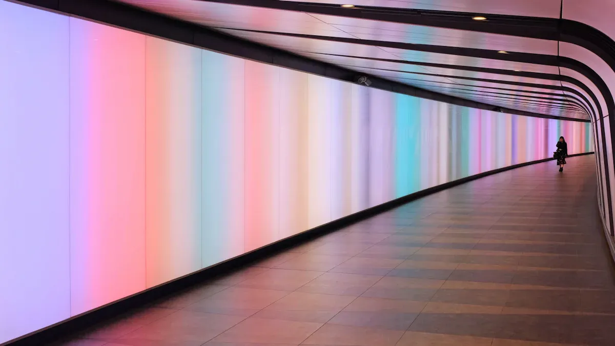
Dynamic lighting makes posters look alive. Programmable lights let people change brightness, color, and patterns. These lights use sensor data to change the display for the place or user. For example, a poster can get brighter when someone walks by. It can also show new pictures at different times. Programmable controls help with quick updates and moving pictures. Lenticular printing adds another cool effect. It uses special lenses to make pictures move or look deep when you walk by. This grabs attention and makes posters easier to remember than normal ones. Lenticular posters make people want to move and interact, which helps collect more data.
Note: Technology and integration help posters become smarter and more fun. With real-time data, designers make posters that react to people and their surroundings.
Psychology of Colors and Visual Impact
Attracting Attention
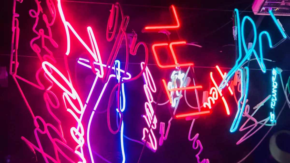
The psychology of colors helps posters get noticed. Bright colors like red, yellow, and green stand out in crowds. These colors grab your attention fast, especially with glowing lights. Designers use the psychology of colors to show you what is important on the poster. For example, a red edge or a bright yellow headline makes you look right away.
Red means something is urgent or exciting.
Yellow grabs your attention and makes you curious.
Green shows safety and balance.
Lighting makes these colors even stronger. When a poster lights up, the colors look brighter. This makes it hard to miss the message. The psychology of colors says people react to these colors right away. The brain connects color to feelings, so you feel something before reading.
Posters with bright lights and strong colors are easier to see. This helps people notice and remember what the poster says.
Shapes and pictures matter too. Big shapes and simple icons work well with bright colors. They help your brain understand the poster faster. Sometimes, a color stays in your eyes after you look away. This makes the poster easier to remember.
Color Effects
Color effects in light-up posters depend on how designers use color. The psychology of colors says bright colors make posters look bold and full of energy. Less bright colors make things feel calm or serious. Mixing light and dark colors adds drama or makes things soft.
Bright colors make posters feel lively or even too strong.
Less bright colors help you focus and feel calm or sad.
Strong differences between colors make posters feel intense, good for action.
Soft differences make posters feel gentle or dreamy.
The psychology of colors also changes with where the poster is. For example, red with white feels urgent, but blue with white feels calm. How you feel depends on what the poster shows and where it is. Studies show red gets attention fast when it matches the message, like a sale. This happens in the brain without thinking, showing color and feelings work together.
Designers use color psychology to pick the best colors for each poster. They know that:
Red makes your heart beat faster and makes you hungry, good for food or sales.
Blue calms you and builds trust, good for business or health.
Yellow makes people happy and creative, but too much can hurt your eyes.
Green means growth and safety, good for nature or health.
Black shows luxury and power, good for fancy brands.
Texture changes how colors feel too. Shiny surfaces make colors look brighter and more exciting. Matte finishes make posters softer and cut down on glare. The psychology of colors shows that texture and color together change how people feel about a poster.
Emotional Response
Emotional response is a big part of the psychology of colors. Colors make you feel something before you think about the message. The brain links colors to feelings through the limbic system. This helps posters make a strong first impression.
Blue makes people feel calm and safe.
Red makes people excited and full of energy.
Green helps people relax and feel safe.
Yellow makes people happy and gives ideas.
Black makes people think of power and style.
The psychology of colors also helps you remember posters. People remember posters better when the colors match the message. For example, a green poster about recycling feels right and is easy to remember. A red poster about a sale feels urgent and important.
Shapes and pictures help too. Simple shapes and clear icons help your brain understand the message fast. Sometimes, a color stays in your eyes after you look away. This makes the poster stick in your mind. The psychology of colors, with smart lighting and design, helps posters make a strong impact.
Tip: Designers should try different color and light mixes to see which ones make people feel the strongest emotions.
Color | Emotion Triggered | Best Use Case |
|---|---|---|
Red | Excitement, urgency | Sales, food, alerts |
Blue | Calm, trust | Corporate, healthcare |
Yellow | Happiness, optimism | Creativity, children’s ads |
Green | Growth, safety | Nature, wellness, eco ads |
Black | Luxury, authority | Premium brands, contrast |
The psychology of colors helps designers make every choice in light-up posters. By knowing how colors, shapes, and lights work together, designers make posters that get attention, shape feelings, and help people remember the message.
What Makes a Good Poster
Content and Symbolism
A good poster needs clear words and strong symbols. Designers pick good icons and pictures that fit the poster’s topic. This helps people get the message fast and feel the right emotion. For example, a dove on a memorial poster means peace and comfort. Using symbols in posters makes hard ideas simple and easy to remember. Designers use both pictures and words, but not too many, so the message stays clear.
Icons and pictures that match the topic make the message stronger.
Symbols help people feel something when they see the poster.
Simple designs help people understand the idea quickly.
Symbol | Meaning(s) & Emotional Impact |
|---|---|
Skull | Death, mortality, warning, brings feelings of fear and worry |
Crescent | New beginnings, rebirth, immortality, growth, dreams |
Star | Hope, wishes, magic, spiritual struggle, distance |
Light | Purity, goodness, clarity, insight, knowledge, enlightenment |
Real-World Uses
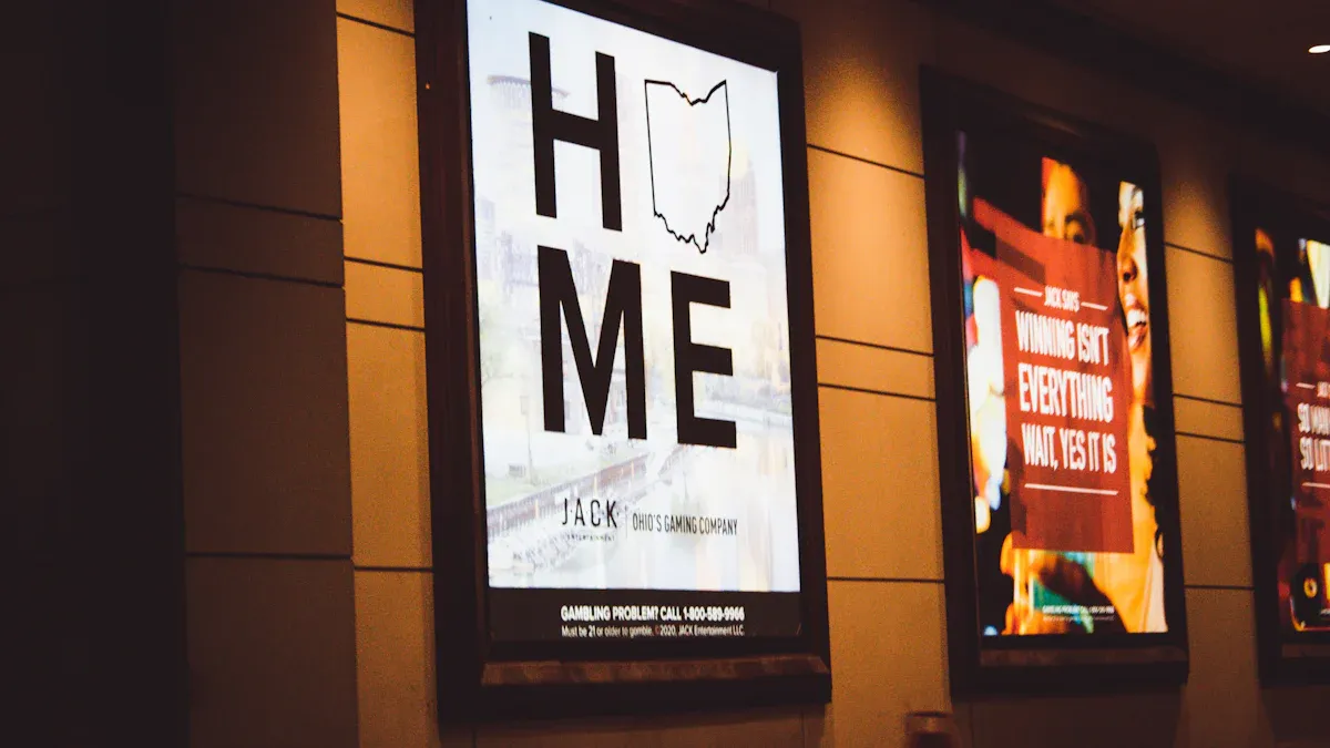
Designers use light-up posters in many places. In ads, brands use digital signs and LED screens to grab attention and get people to join in. Museums and schools use posters with AR or VR to make learning fun and easy to remember. Public safety teams use digital posters to give updates, help with crowds, and share health tips. In the past, WPA posters taught people about staying healthy and safe. These examples show that posters can change what people do and help share important news.
Ads: Brands use LED posters for sales and events.
Learning: Museums and schools use interactive posters to teach.
Safety: Cities use digital posters for alerts and help.
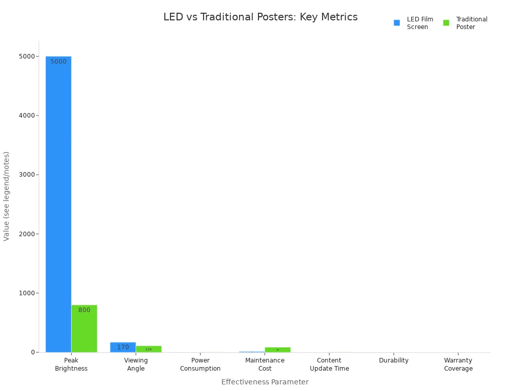
The chart above shows LED posters are brighter, last longer, and cost less than old posters. This proves that new poster designs work better in real life.
Engagement and Retention
Poster design uses psychology and tech to keep people interested. Designers learn about their audience and what they want to say. They add things like QR codes or games to make people stop and take part. Social media links and ways to give feedback help people stay connected after seeing the poster. Stores find that LED posters with moving pictures and quick updates get more people to look and buy. Designers watch how people use the posters and make changes to keep them fun and useful.
Games and interactive things help people join in.
QR codes and social media links help more people see the poster.
Feedback helps designers make better posters next time.
These facts show that a good poster uses smart design, clear words, and the right tech to grab attention and help people remember the message.
Materials, technology, and visual psychology all help light-up posters work better than old ones. Designers pick smart materials and add fun features to get people’s attention in art, stores, and safety places. Today’s LED posters use earth-friendly materials and can fit in many places. New ideas include touchscreens, AR, and displays that save energy. As design and technology get better, light-up posters will keep changing how we see and remember messages. Will the next group of posters change how we learn and connect?
FAQ
What makes LED posters more energy-efficient than traditional posters?
LED posters save energy because LEDs turn most power into light. They do not waste much energy as heat. This helps lower electric bills and saves energy.
Tip: LEDs last a long time, so you do not need to change them often.
Can illuminated posters work outdoors?
Yes, designers use strong materials and seals to keep posters safe outside. These posters can handle rain, dust, and sun. Outdoor LED posters have UV-resistant coatings to last longer.
How do interactive posters collect user data?
Interactive posters use sensors, touchscreens, or cameras to watch what people do.
Sensors collect information.
Designers use this data to make posters better.
Are light-up posters safe for the environment?
Many new posters use earth-friendly materials like recycled plastic or mushroom-based substrates.
Material | Eco Benefit |
|---|---|
Recycled plastic | Cuts down on trash |
Mushroom-based | Breaks down easily |
Why do colors look brighter on illuminated posters?
Light goes through or bounces off special coatings to make colors pop. Bright LEDs and diffusers help colors show up, even when it is sunny.
See Also
Exploring Various LED Sign Types And Effective Usage Methods
Different Acrylic Neon Light Boxes And Their Key Advantages
Complete Guide To Enhancing Brand Visibility With Acrylic Signs
Upcoming Trends And Innovations In LED Digital Displays
Creating Stunning Acrylic Light Box Displays That Attract Attention